Lynching in America
GOOGLE & EQUAL JUSTICE INITIATIVE
Google and the Equal Justice Initiative joined together to tell the stories of families affected by the history of racial terror in America.
In celebration of the hundred year anniversary of the National Parks Service, we created an interactive tour of five of America’s most beautiful national parks led by real park rangers.
EARLY FLOW OPTION
About the Project
For 28 years, EJI has been conducting research and collecting data about the effects of lynching in America during the era of racial terror, from 1865 to 1950. During this difficult time in America’s history, over 4,000 people of color were lynched by white Americans and there has never been justice for the victims and their families. We turned this data into a collection of interactive maps and stories that greatly expanded access to EJI’s work. EJI wanted to bring this history back to the front of our collective political consciousness in a way that forces us to confront our country’s dark past and the legacy it left for so many families.
Using 16:9 video, 360° video and ambisonic audio, users were able to partake in experiences the average park visitor never gets to see. We shot from helicopters, mountain tops, horseback, and underwater, resulting in over eleven terabytes of footage gathered over twenty-six days and 18,949 miles, edited down to a final experience of twenty-five minutes.
EARLY FLOW OPTION
Multiple options for the global flow of the site- guided tour verse exploritory.
UX Challenges
One of the many challenges of this project was the subject matter. We acknowledge that this isn’t easy for many users to face, which is why the content was presented through different mediums: audio stories, data on interactive maps and a short film. We needed to find a way to create a through-line weaving these three different storytelling media together to form a continuous narrative. Through the content hierarchy, we also needed to balance real, human stories with EJI’s data.

SKETCH OF INTERACTIVE MAP WITH NUMBER OF LYNCHING VICTIMS DATA
For this project, it was especially important that the content is as accessible as possible, which is why we worked from a mobile-first design perspective to guarantee an equally good experience on both mobile and desktop.
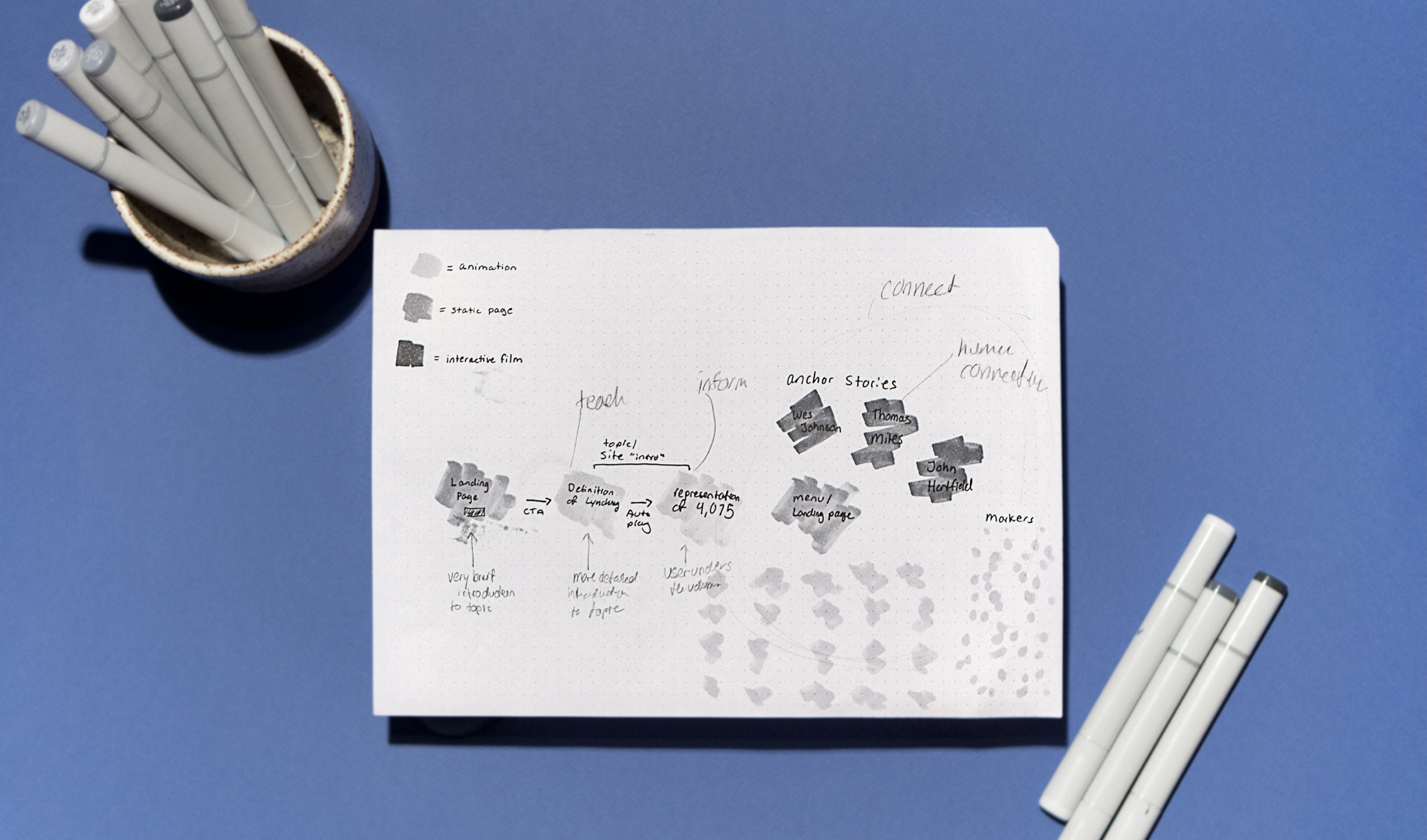
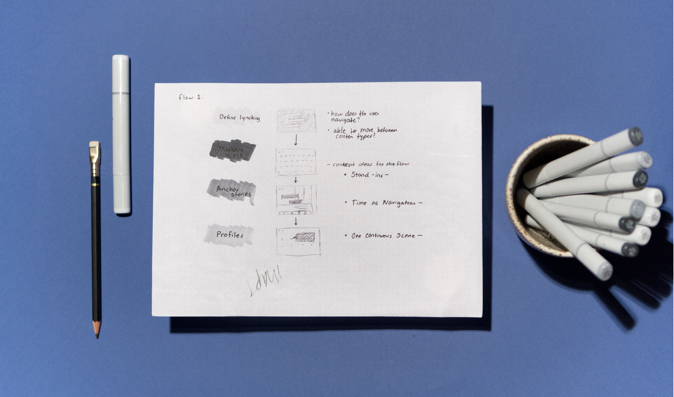
EJI MUSEUM TABLE SCREENS SKETCHES
Additionally, we had to adapt the interactive map for touch display in the Brooklyn Museum and EJI’s own museum in Montgomery, Alabama, which will open in 2018. This posed additional UX challenges, because the same UI had to accommodate users on a mobile screen, desktop users and users on a 80-inch touch screen in a busy museum environment.

MOBILE WIREFRAMES
UX Solutions
To ensure continued interaction with the site after acknowledgment of the subject matter, we let each user’s sense of exploration dictate the flow of the site. After the site’s intro resolves, the user is given the global menu. From there, they can travel to any section of the site. Once the user is in the site’s flow, they can scroll between sections to continue exploring the content or always return to the global nav to jump ahead. We wanted the user to make the choice on how they would explore this subject. Because of the analytics from our National Parks project, we knew that users like choice and they are more likely to stick with something if they choose it rather than getting pushed into a flow they didn’t select.
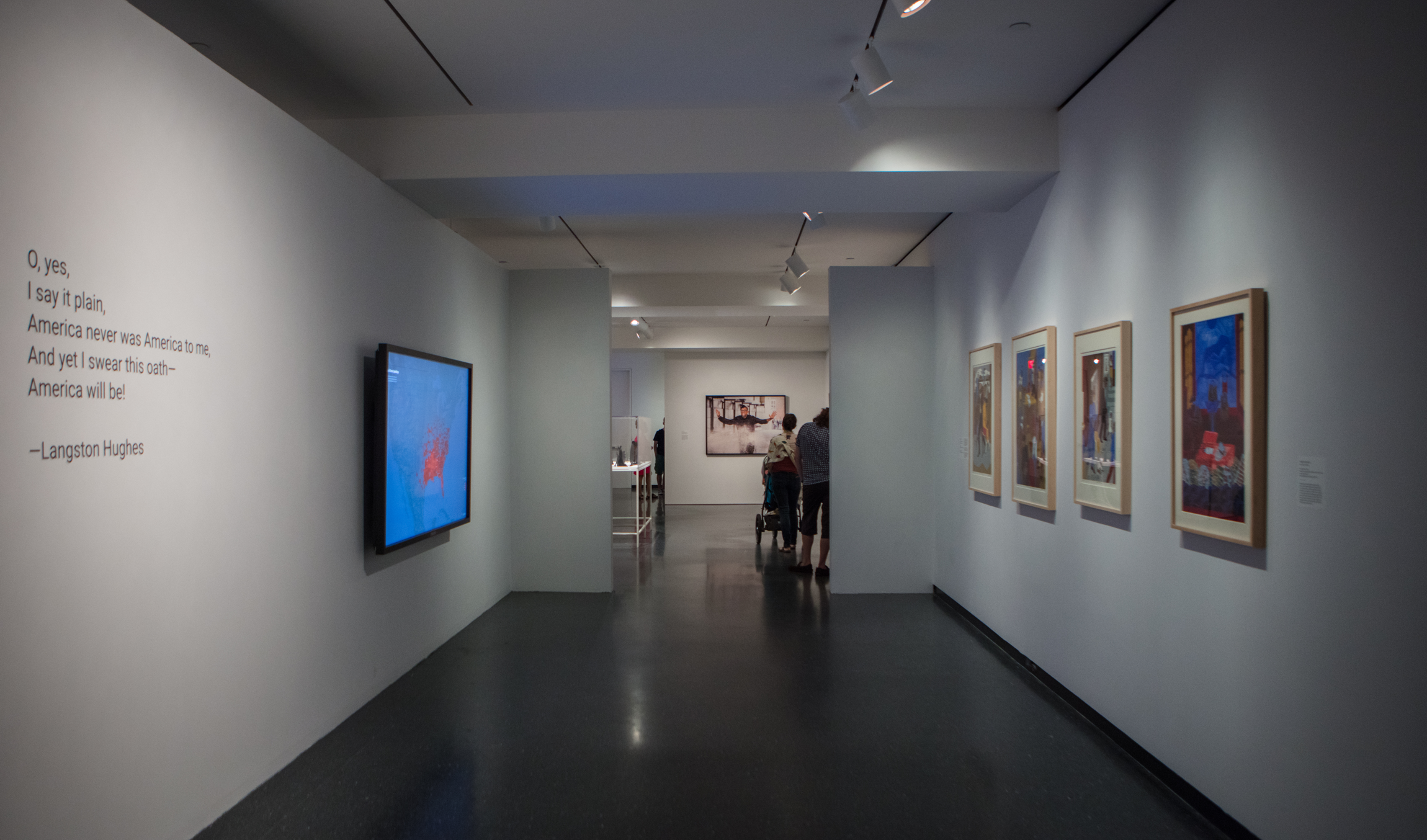
BROOKLYN MUSEUM EXHIBIT, "THE LEGACY OF LYNCHING - CONFRONTING RACIAL TERROR IN AMERICA" JULY 26 - SEPTEMBER 3, 2017. PHOTOGRAPHY BY EMILY KORDOVICH
The site works on desktop and mobile, letting users have the same experience regardless of their device. The main change between desktop and mobile is the map. On mobile, we had to create a state list because the map would be too small for users to interact with. All of the audio content is available on popular music platforms such as Google Play Music, Soundcloud and iTunes, so users can listen to these stories off-line as well.
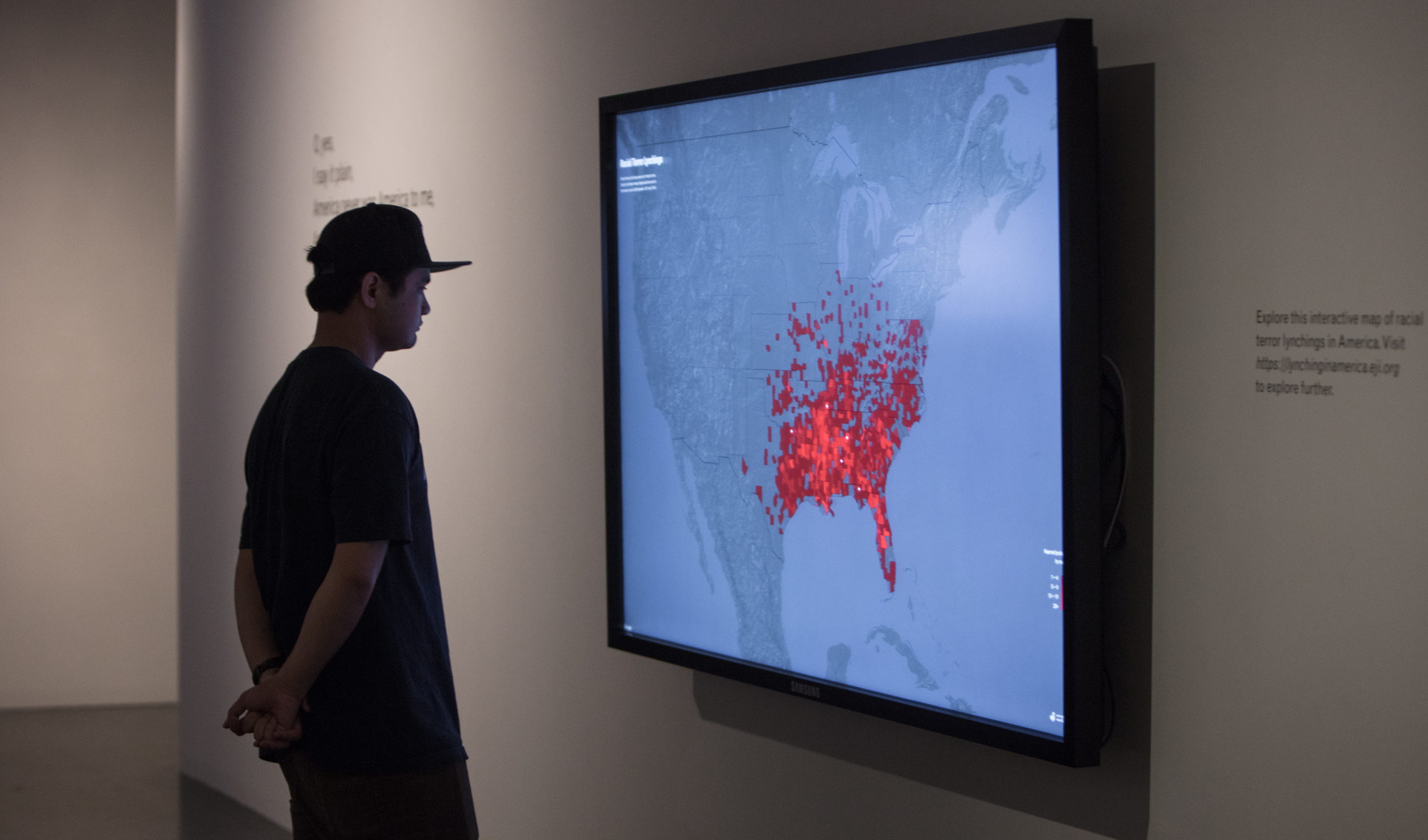
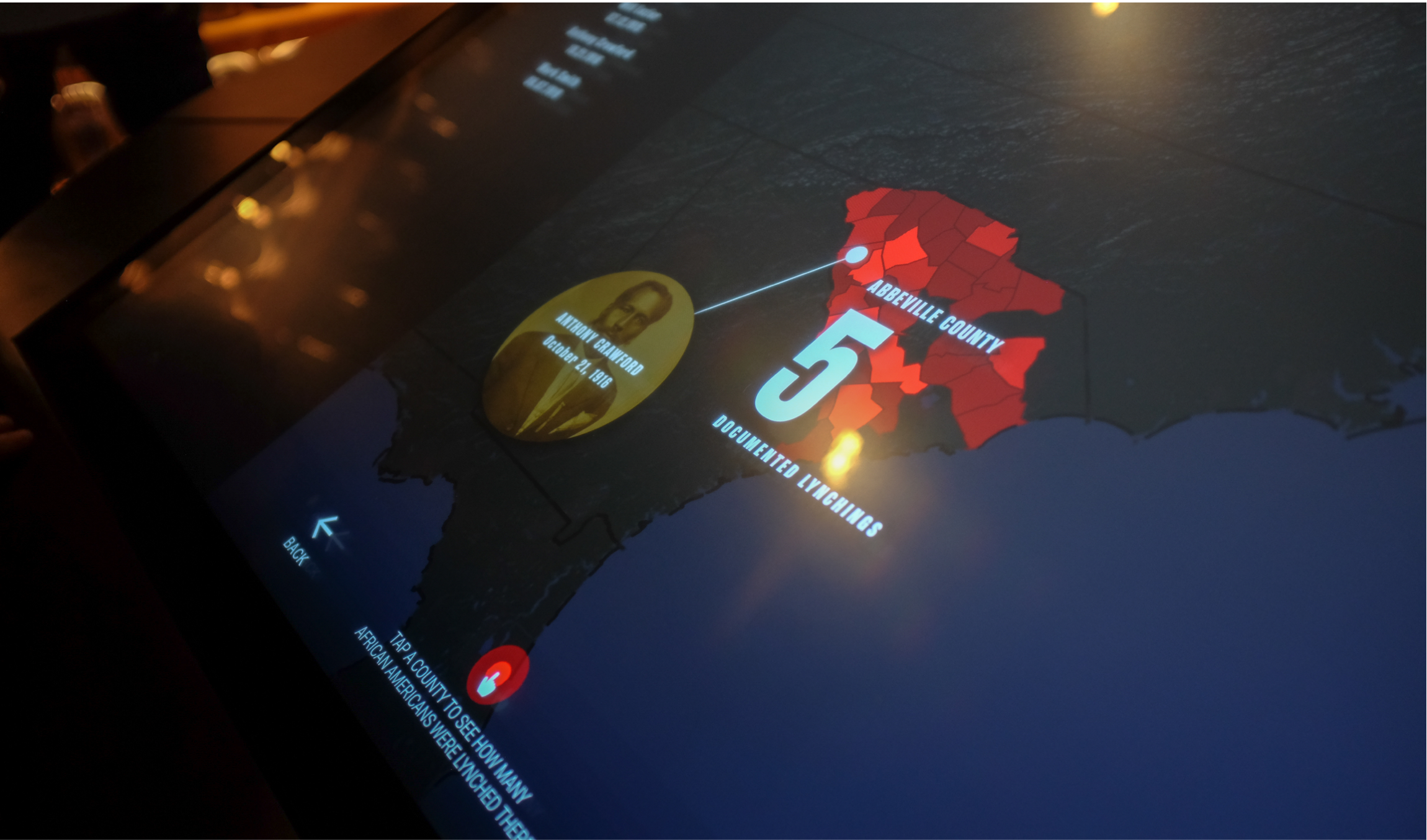
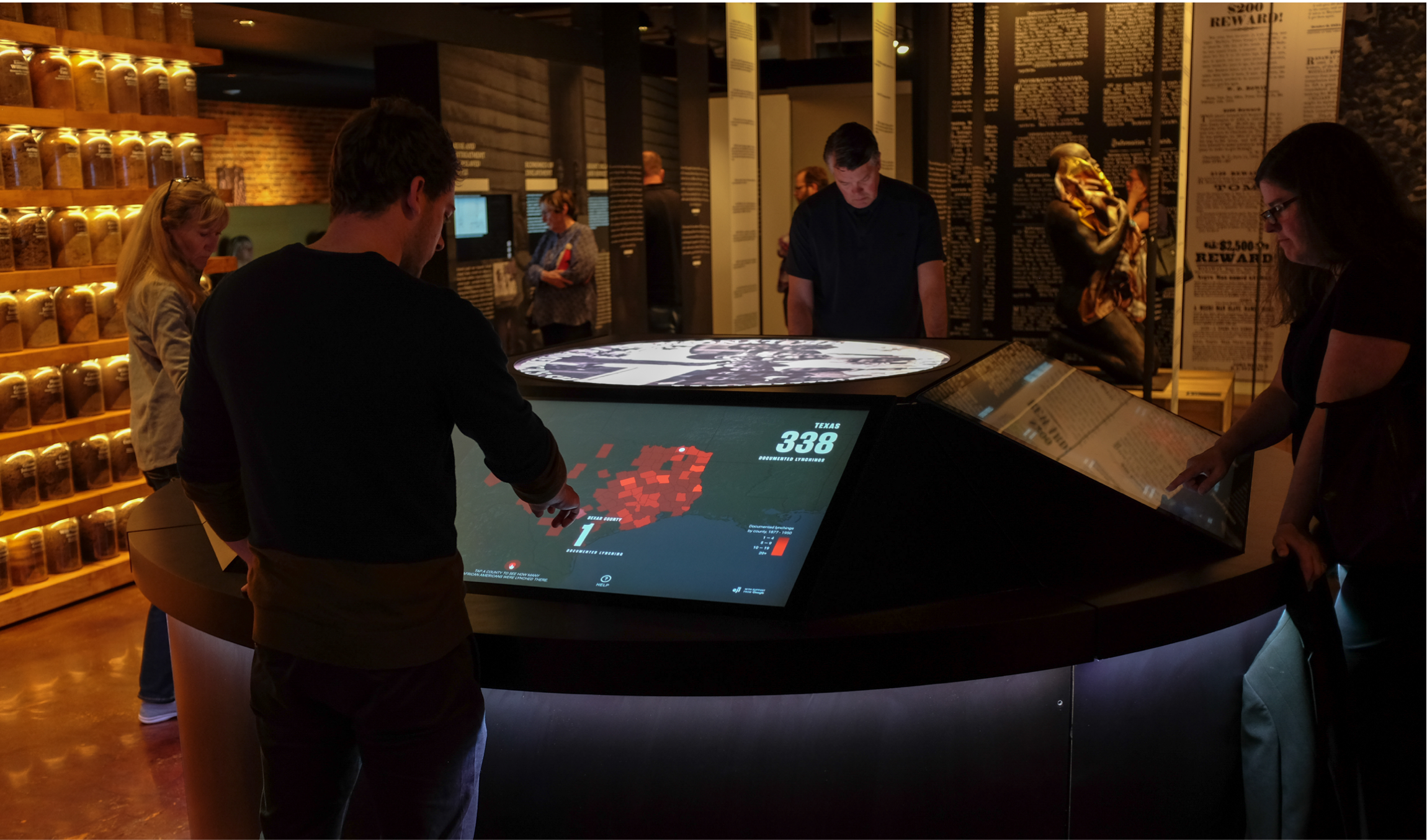
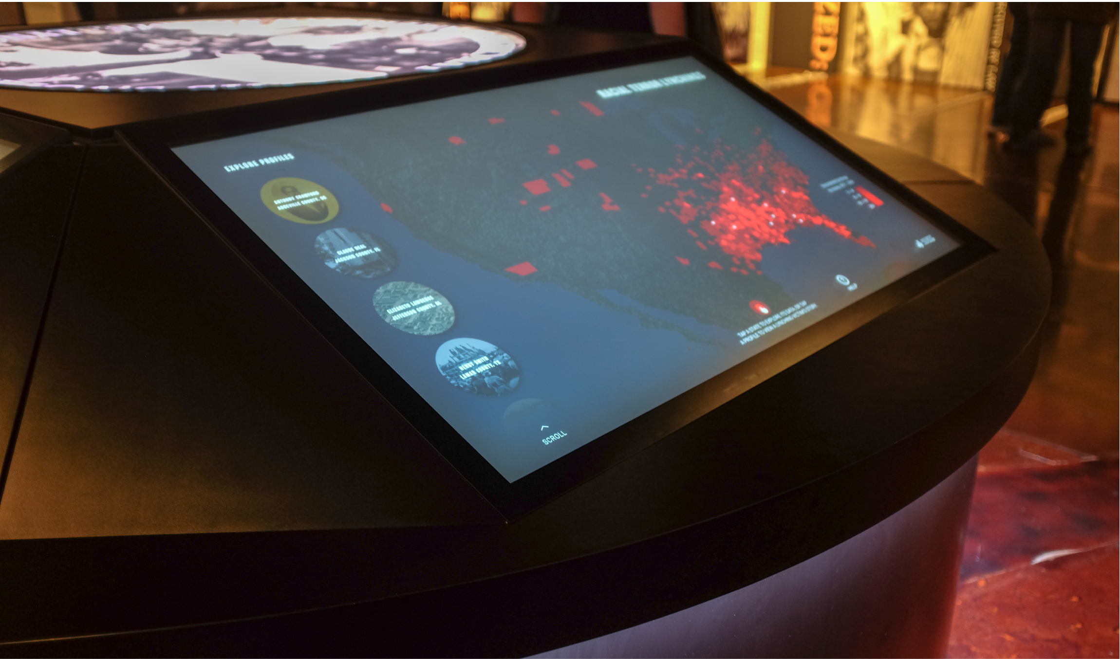
THE INTERACTIVE MAP FROM THE SITE ON AN 80-INCH TOUCH SCREEN IN THE EXHIBIT. USERS ARE INVITED TO EXPLORE STATE DATA AND LISTEN TO PROFILE STORIES. PHOTOGRAPHY BY EMILY KORDOVICH
To make sure the interactive map worked on the Brooklyn Museum touch screen and then later for EJI’s own museum, we tested the map internally multiple times before launch to make sure it would seamlessly on a huge display. For EJI’s museum display, we adjusted the UX to feature more profile stories, clear UI that users can easily reach on the touch screen table regardless of their height, and the ability for the museum to update map data on the backend when they do more research.
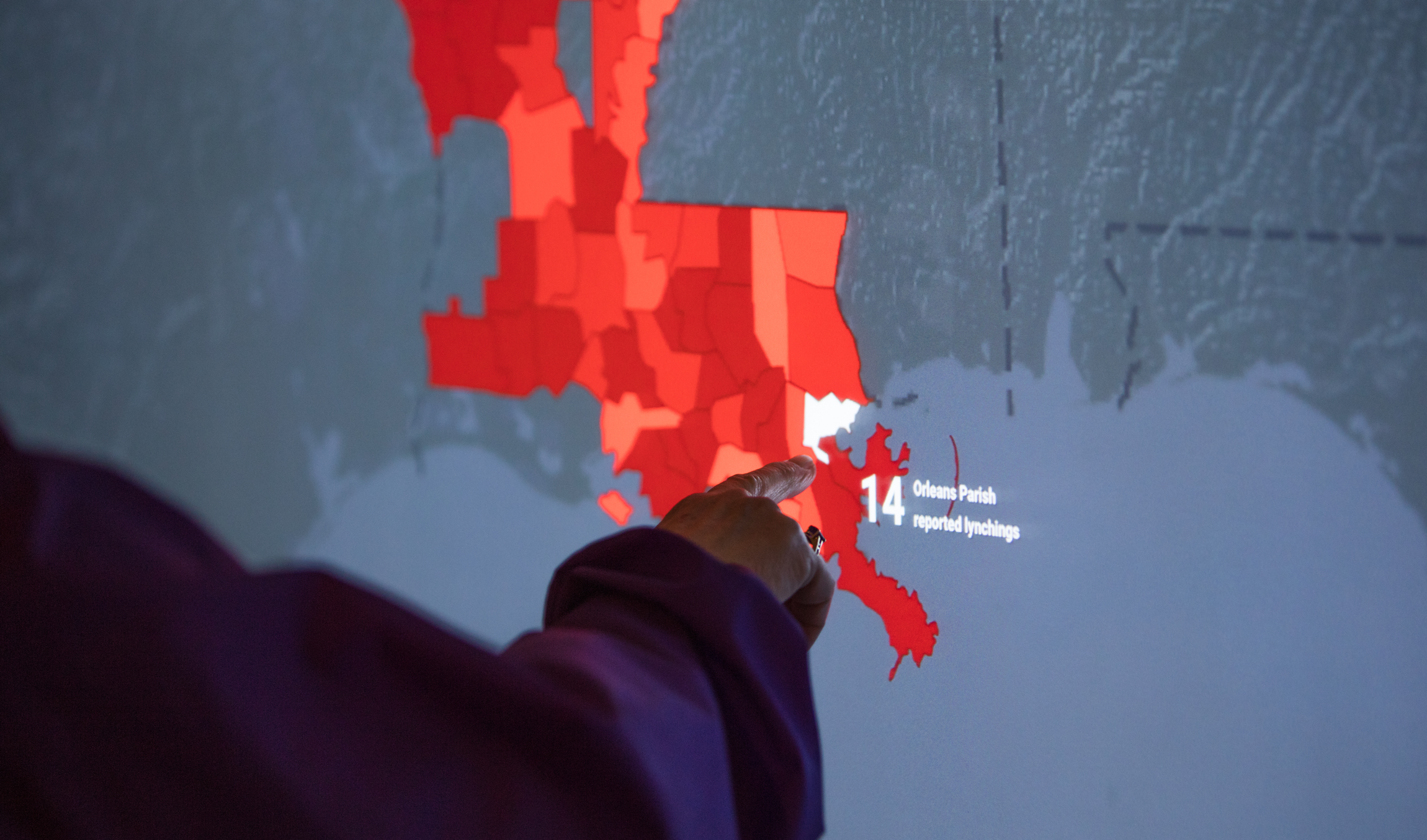
USERS CAN CLICK ON STATES TO EXPLORE EACH COUNTY'S LYNCHING DATA. PHOTOGRAPHY BY EMILY KORDOVICH
USERS CAN WATCH SHORT STORIES ABOUT LYNCHING VICTIMS. PHOTOGRAPHY BY EMILY KORDOVICH
After completing the Lynching In America site and Brooklyn Museum exhibit, EJI reached out to Stink to adapt the map experience to work on touch screens for The Legacy Museum in Montgomery, AL. This required evolving the site UX to work for a different audience, specifically elderly museum visitors, in the space and on large touch screens.
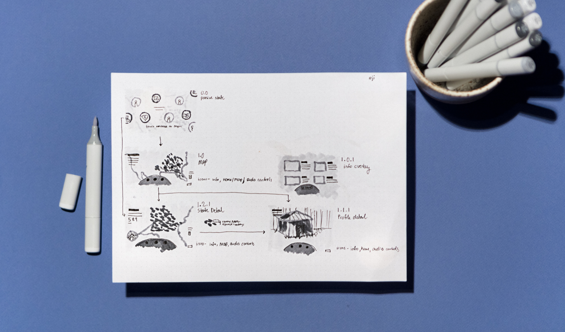
WIREFRAMES FOR THE LEGACY MUSEUM INSTALLATION
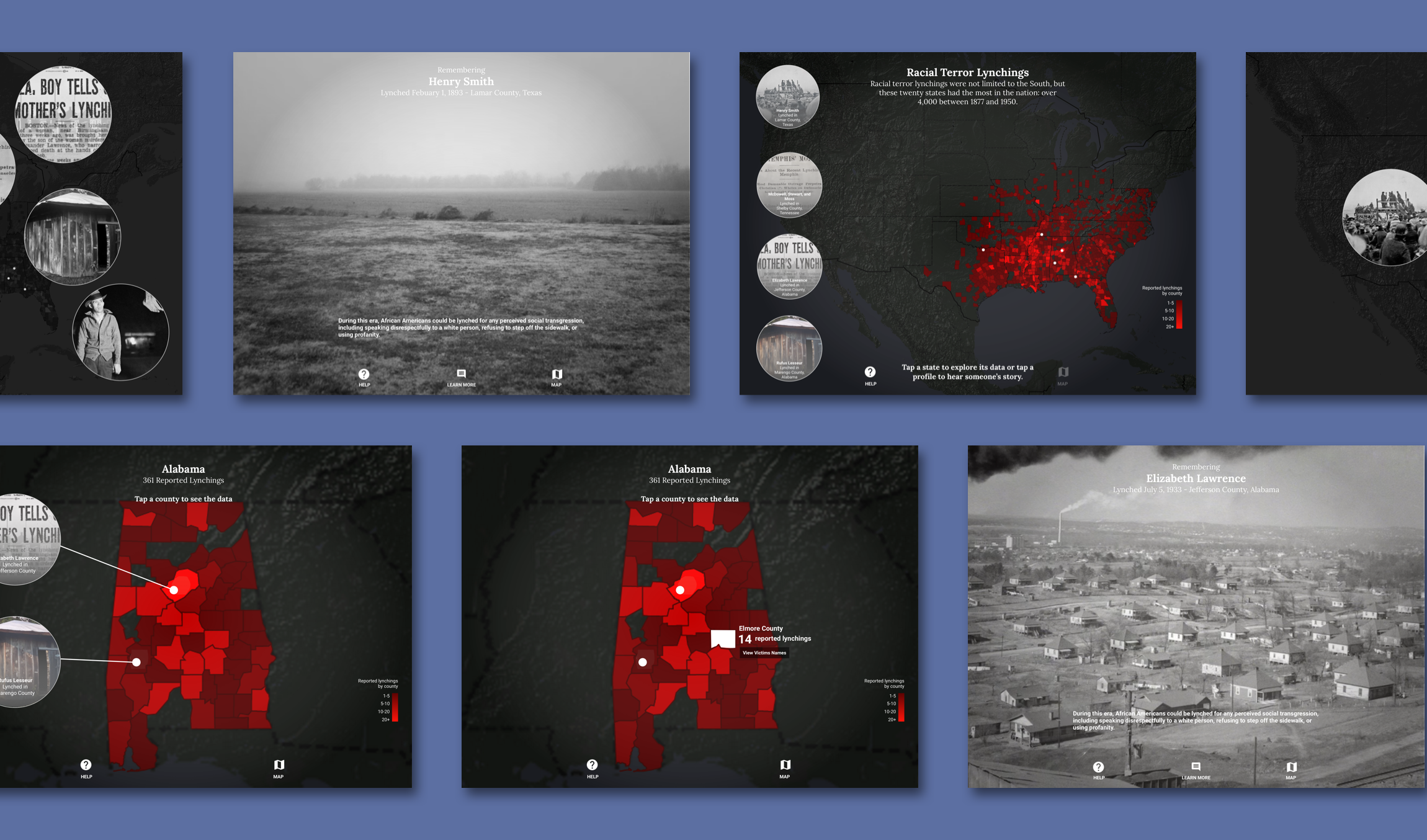
To do this, I simplified the UI along the bottom of the screen to improve access for users standing or sitting at the screen during the experience. To optimize the map for a touch-based experience, we removed all hover states — users would have to click counties within the state view to see the data. Removing the hover states subsequently altered the way users accessed profile stories from the US map level. To accommodate this change, we removed the thumbnails from the map itself and placed them in a left-hand column that the user could use to separately scroll through from the experience. Because of the museum’s target audience, we also added a persistent Help button. Using images and text, this overlay would explain how to interact with the different levels of content.
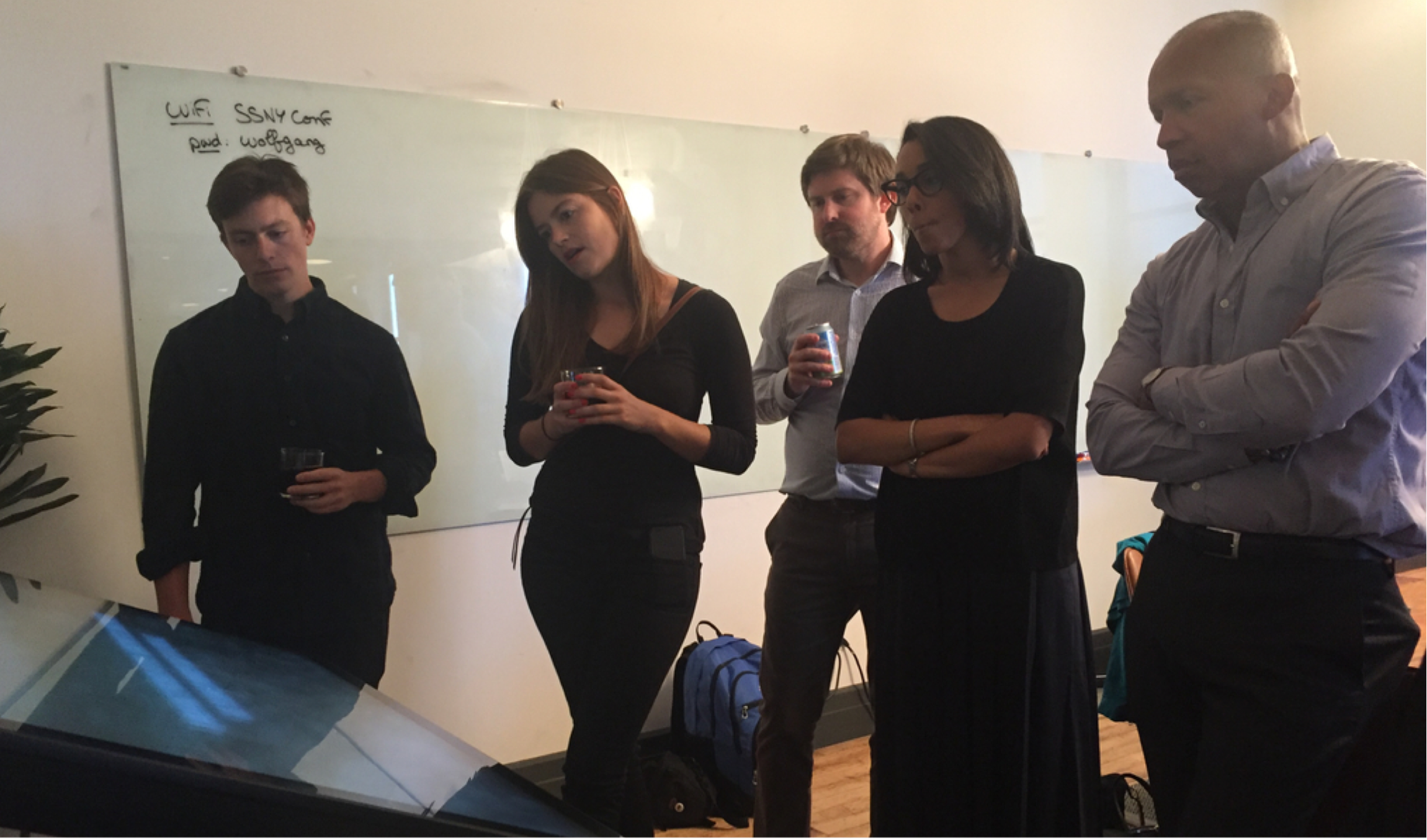
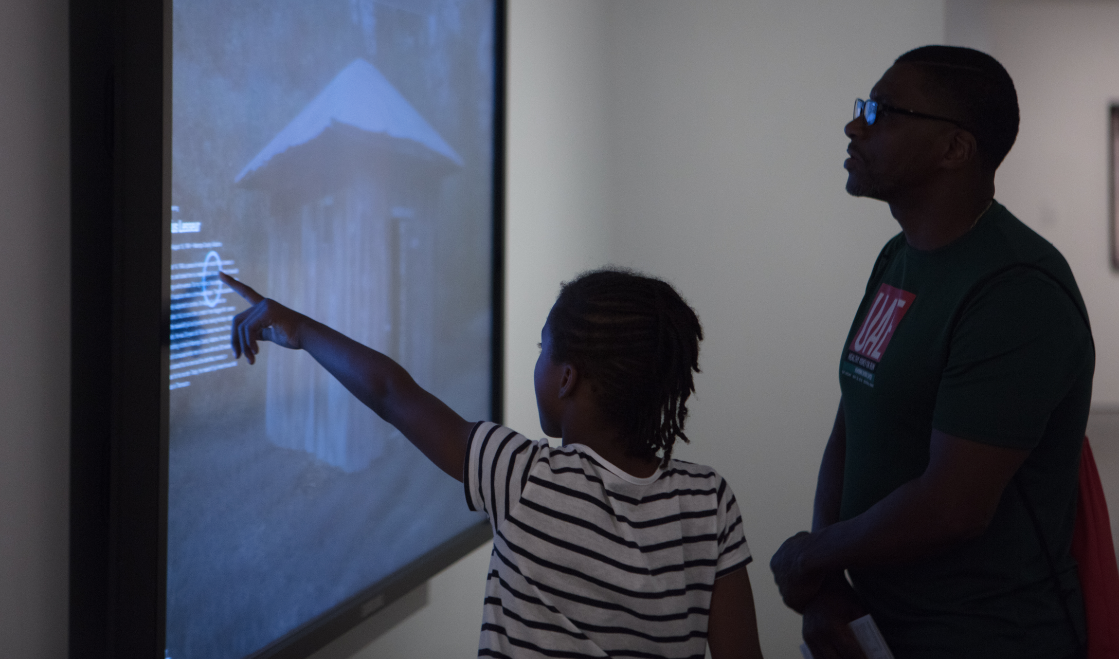
LEADING USER TESTING DURING MUSEUM INSTALLATION DEVELOPMENT WITH EJI’S TEAM, INCLUDING FOUNDER, BRYAN STEVENSON, AND THE MUSEUM’S TARGET AUDIENCE: ELDERLY VISITORS
During the development phase, we user tested with the museum’s target audience and the EJI team. From testing, we found that users enjoyed the option of reading stories rather than listening or watching, in the case they had audio or visual impairments. Users also understood the help button and referenced it if they did not know what to do next after visiting a state.
INSTALLATIONS IN THE LEGACY MUSEUM IN MONTGOMERY, ALABAMA
MAP STATE OF THE INSTALLATION. USERS CAN EXPLORE PROFILE STORIES AND STATE DETAIL PAGES
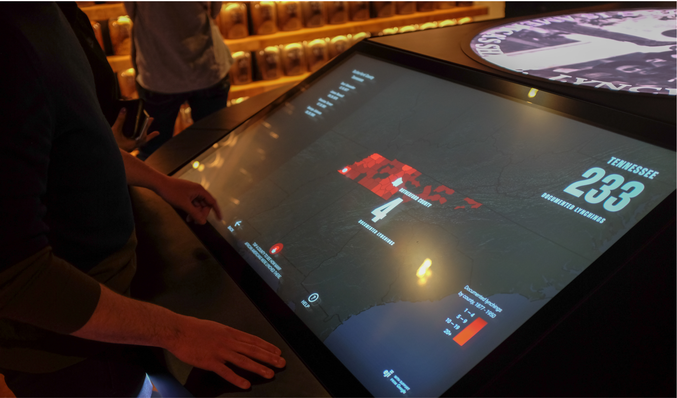
FROM THE STATE DETAIL PAGE, USERS CAN EXPLORE THE NAMES AND NUMBER OF VICTIMS BY STATE AND COUNTY